Reading your charts: weight, deficit and progress photos
A chart is only useful if you can read it at a glance. Strathlon keeps your weight, your calorie deficit and your progress photos in one place, and each one is built to answer a single honest question: is what you're doing actually working? Here's how to read them.
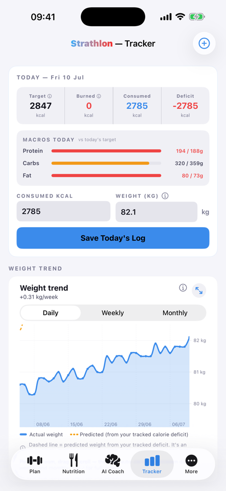
Your weight chart
The weight chart always opens on your most recent data, so you never land on an empty stretch of the year. Switch between Daily, Weekly and Monthly to change how much you're looking at — daily for the last few weeks, monthly for the long arc. Pinch to zoom in on any stretch you want a closer look at.
- Trend line by default. The chart opens on a clean line so you can see the direction of travel without the day-to-day noise.
- Candlestick view when you want it. Toggle it on and each period shows its full range — the highs and lows within a week or a month, not just the average.
Day-to-day weight bounces around with water, food and time of day. The point of the trend line is to look past that and see whether the real number is moving the way you want.
Your calorie-deficit chart
This chart shows your calorie deficit over time — how far under (or over) maintenance you've been running. On the premium tier it goes a step further and plots your predicted weight against your actual scale weight, side by side, so you can see whether the maths is matching the scale. When the two track together, your logging and your body agree. When they drift apart, that's worth a look — and it's exactly what the "explain my gap" reading is for.
Two ways to log your weight
Logging should never be the reason you stop. You can:
- Type it in. The quickest way if you've just weighed yourself — and a weight you type always wins for that day.
- Let Apple Health do it. A smart scale that already syncs to Apple Health flows straight through: your weigh-ins arrive automatically, with no "update your weight?" tap to confirm. What you see on your Tracker stays your latest reading, while your targets follow a ~7-day trend of your weight, so one noisy morning doesn't shift your calories and macros.
Progress photos
The scale misses things — recomposition, posture, the way clothes fit. Progress photos catch what a number can't. They're private and stored on your device, and you can line two up side by side to see the change across weeks or months. Often that comparison is more motivating than any chart, because it shows progress the scale was quietly hiding.
Your targets, explained
Under Profile → Your Targets you'll find the numbers that drive everything else: your BMR and BMI, your calorie and macro targets, and your heart-rate zones. Each one has a plain-English "i" explainer, so you're never staring at an acronym wondering what it means or where it came from.
Weight and deficit tracking come with the app. The one premium piece here is "explain my gap" — the AI reading of your predicted-versus-actual weight — which lives in the AI Coach. Everything else on this page is free.
← All articles · Understanding your stats · Explain my gap · Home